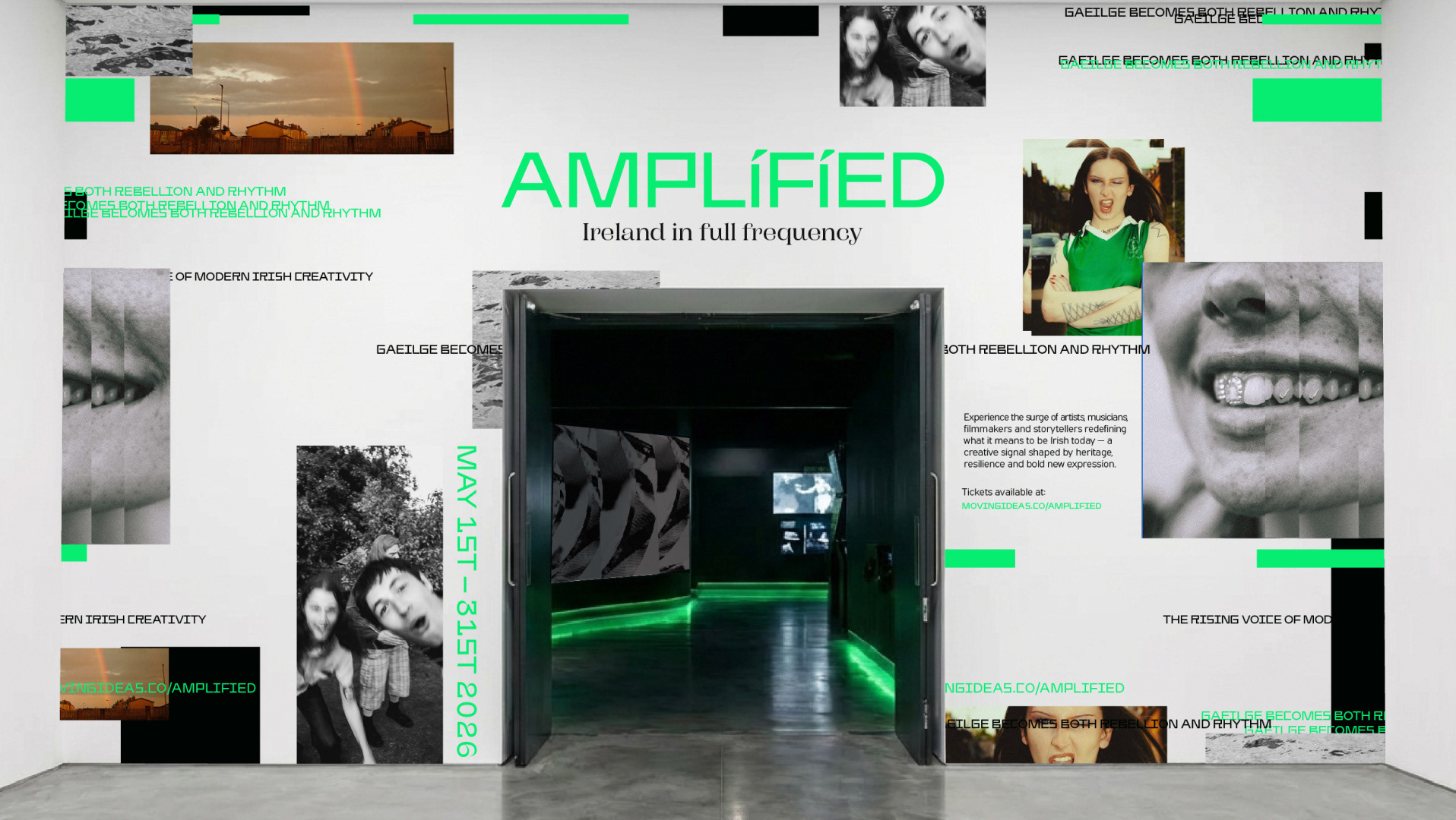
[ The Challenge ]
Makes Sense is a female-founded sustainable soap brand built on the idea that eco-conscious choices can feel playful and modern. What began as a packaging project evolved into a full brand concept for millennial and Gen Z audiences. The challenge was to communicate sustainability without feeling preachy — creating a brand that feels simple, intuitive and, ultimately, just makes sense.
Brand Identity, Packaging, Digital Roll out & Pop Up Environment.
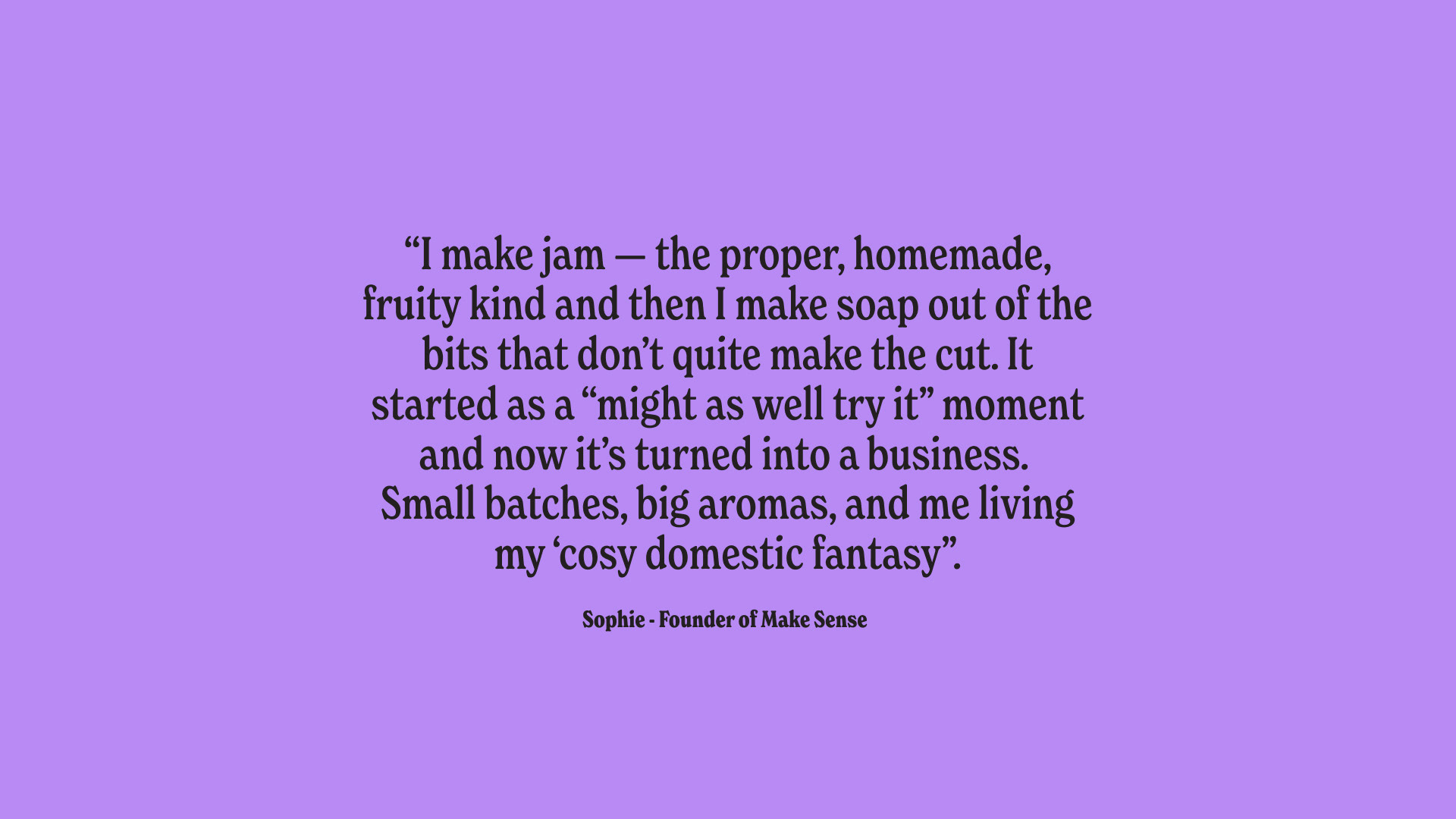
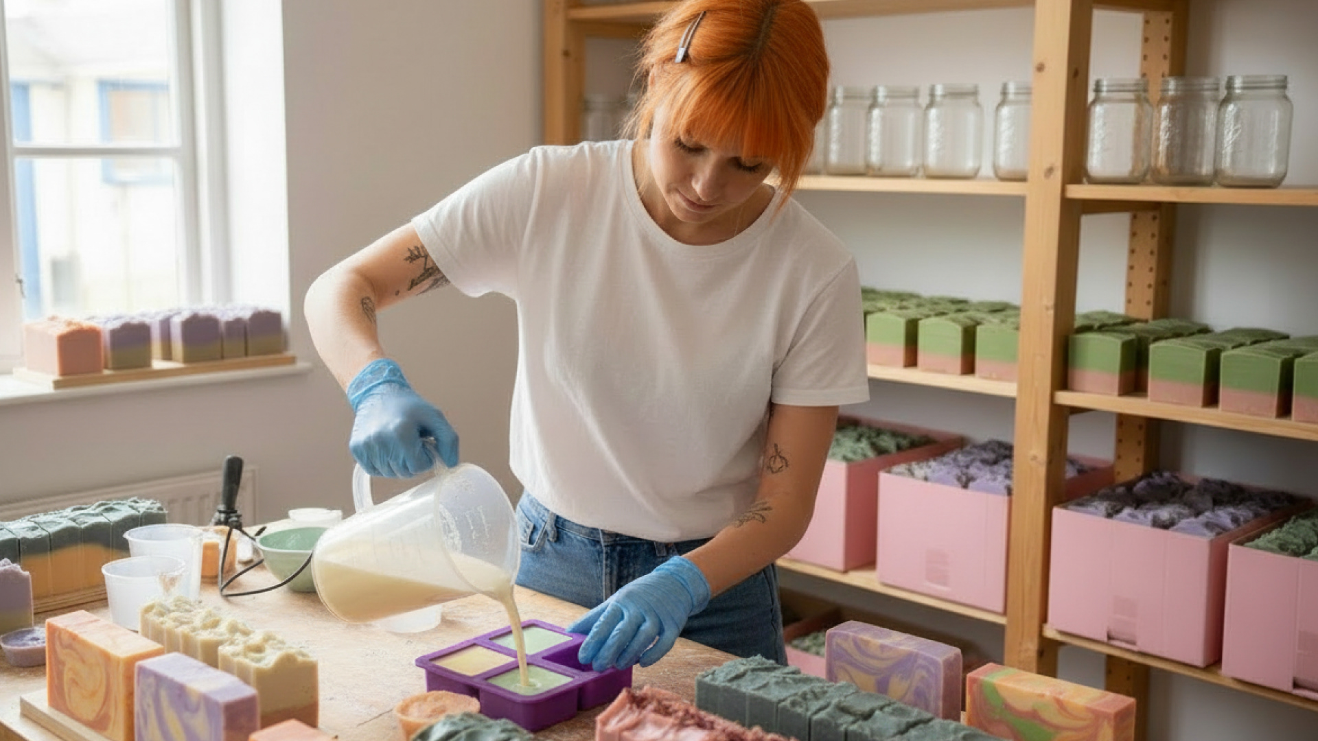
The name “Makes Sense” became the foundation for the entire concept — simple, confident and intuitive. Reflecting the idea that sustainable choices shouldn’t need heavy explanation; they should just feel obvious. The brand is shaped by its founder, Sophie, whose personal story helped guide the tone of voice. Rather than a faceless eco brand, the project focused on building something human, hands-on and relatable.
[The Identity]
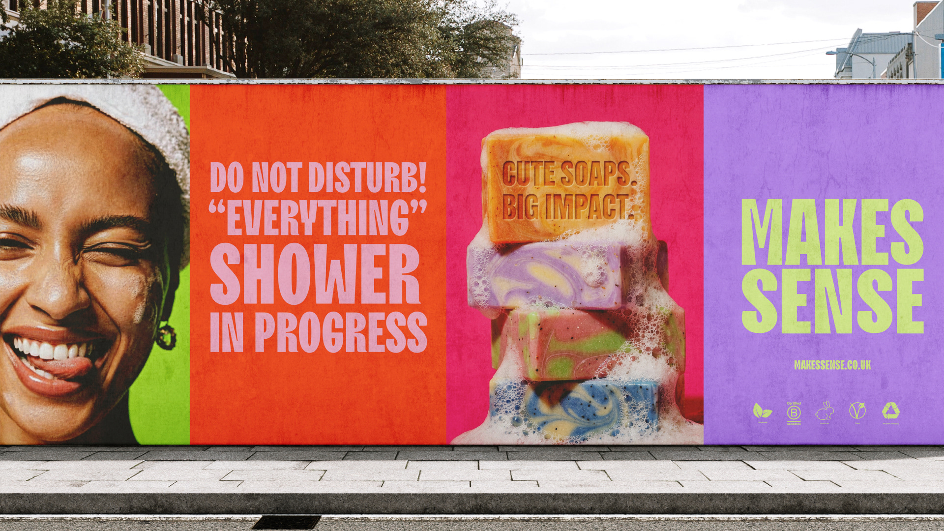
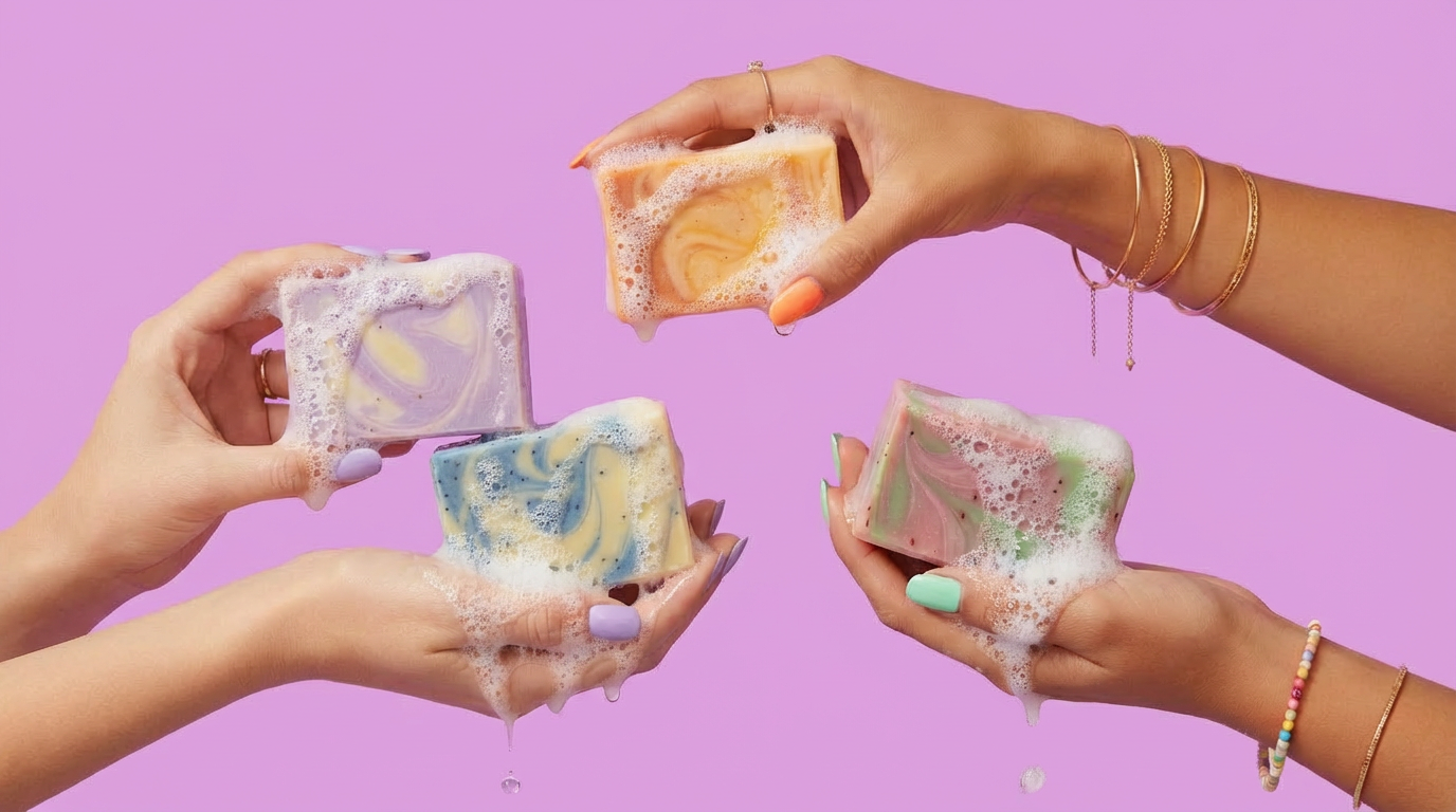
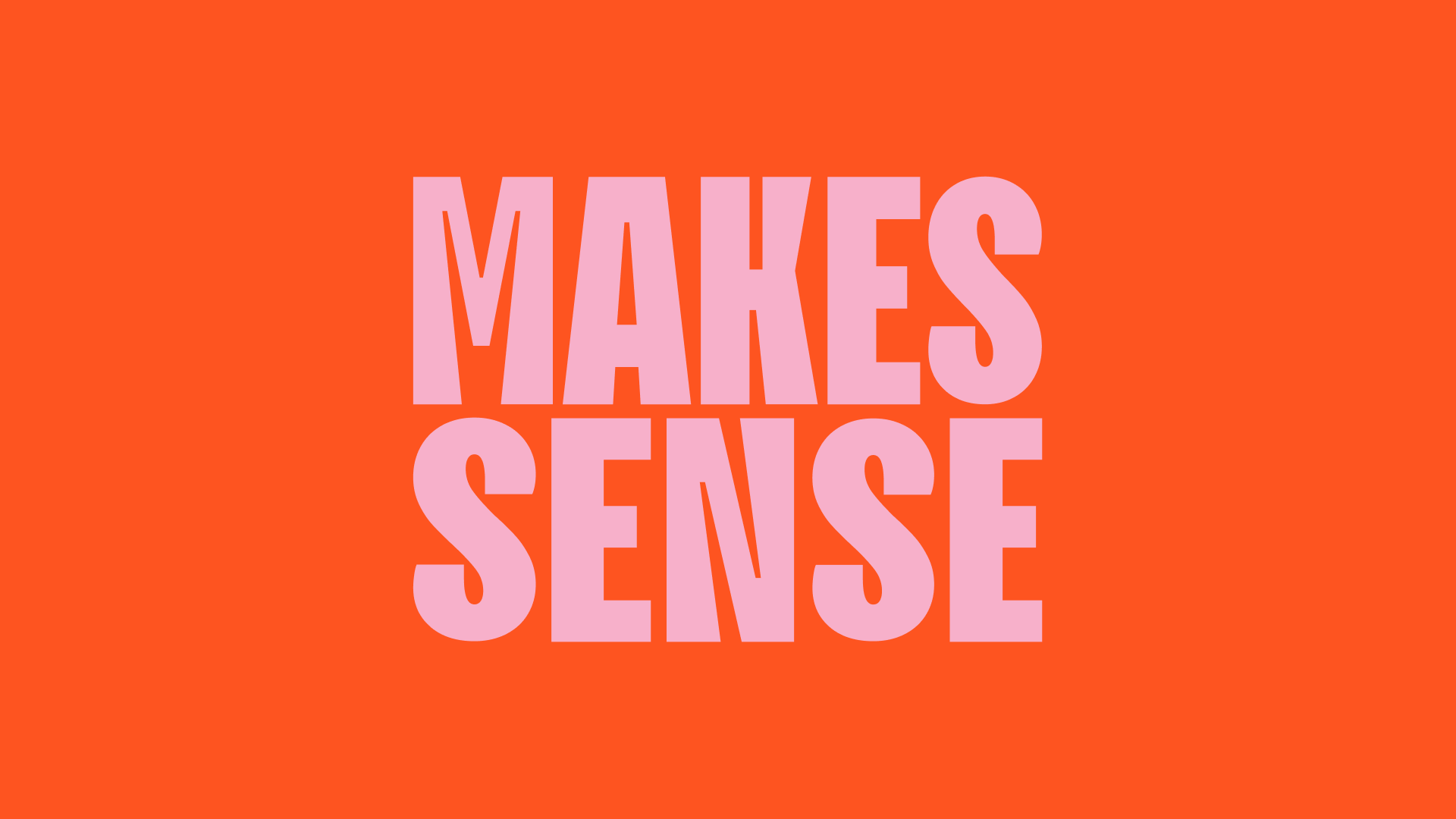
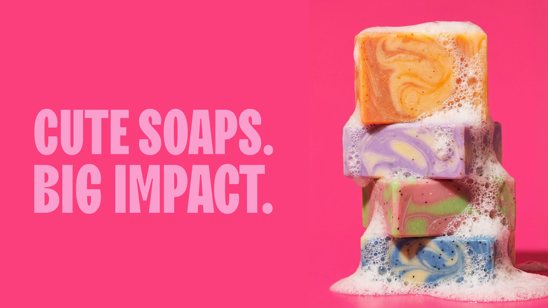
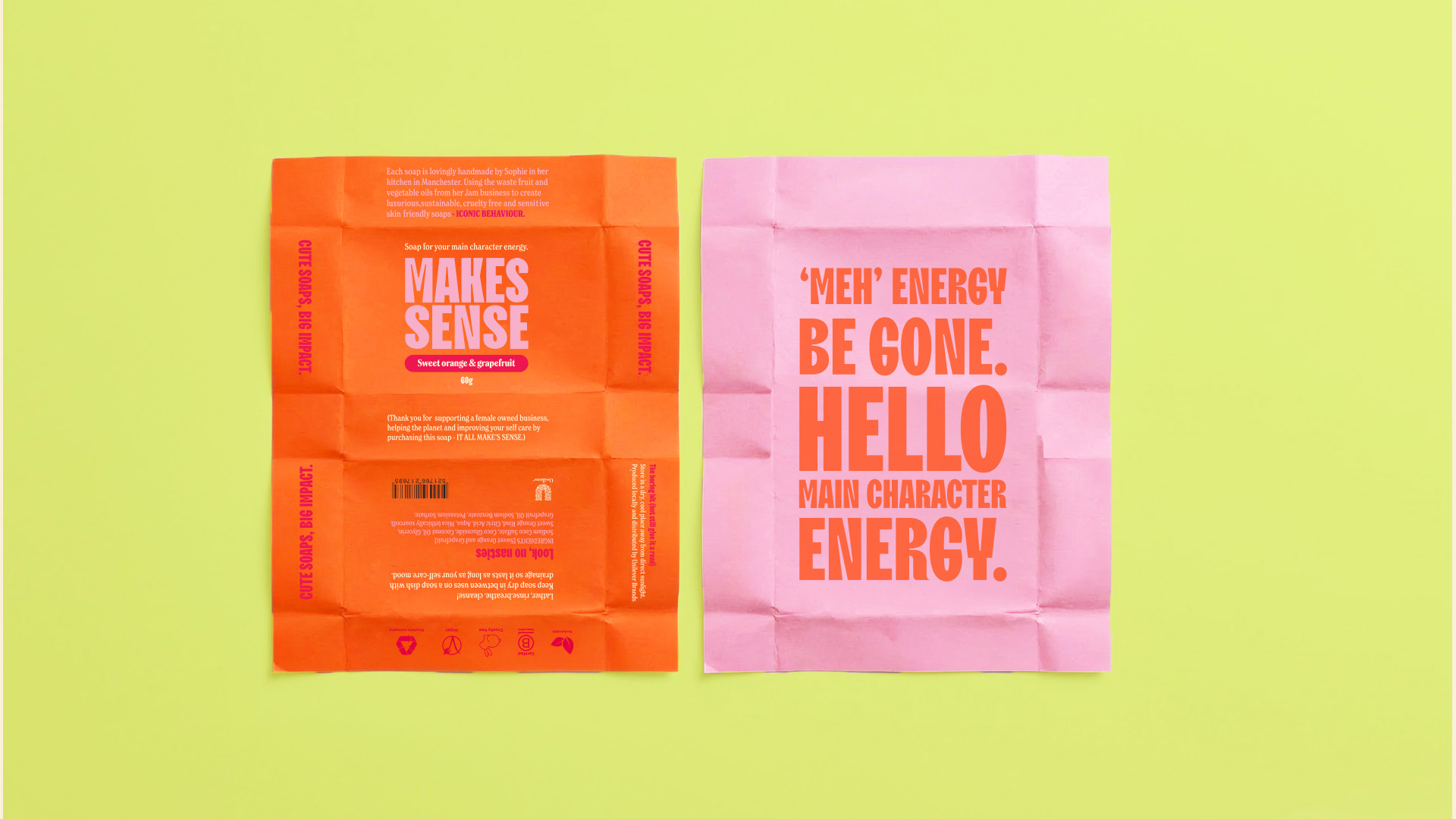
The visual identity is designed to feel zesty, effervescent and bold. Typography leads the system, using TT Trailers for its playful counters and punchy character. Vibrant, ingredient-led colours bring energy and personality, while messaging such as “Cute Soap. Big Impact.” captures the balance between everyday products and meaningful environmental change.
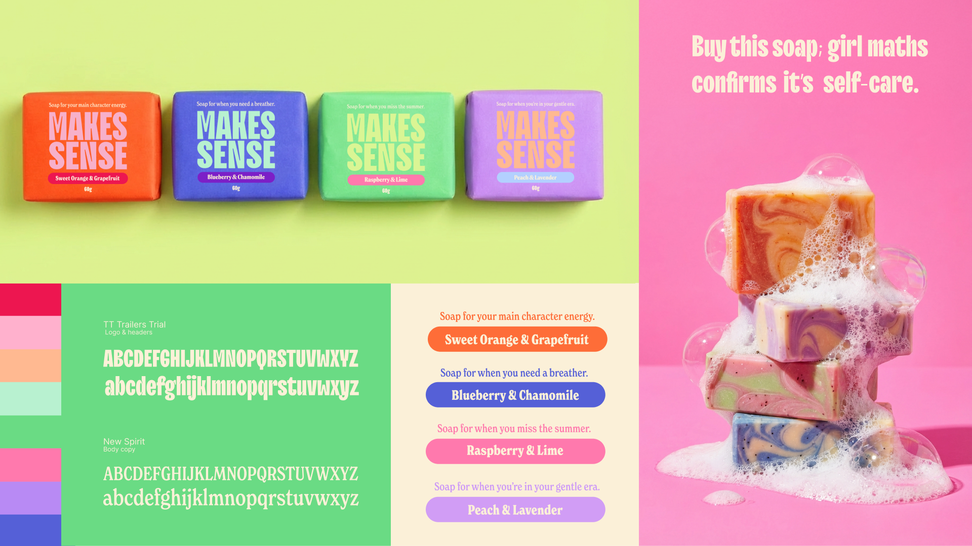
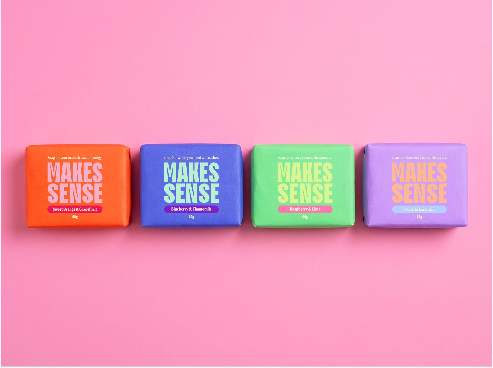
The packaging brings the tone of voice to life across both the outer and inner sleeve - designed as a keepsake long after the soap itself is finished.
[The Result]
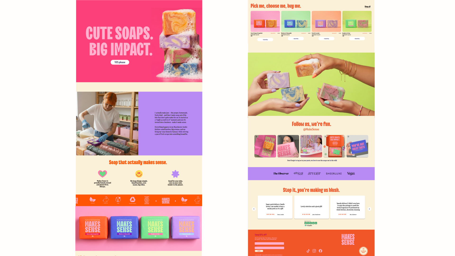
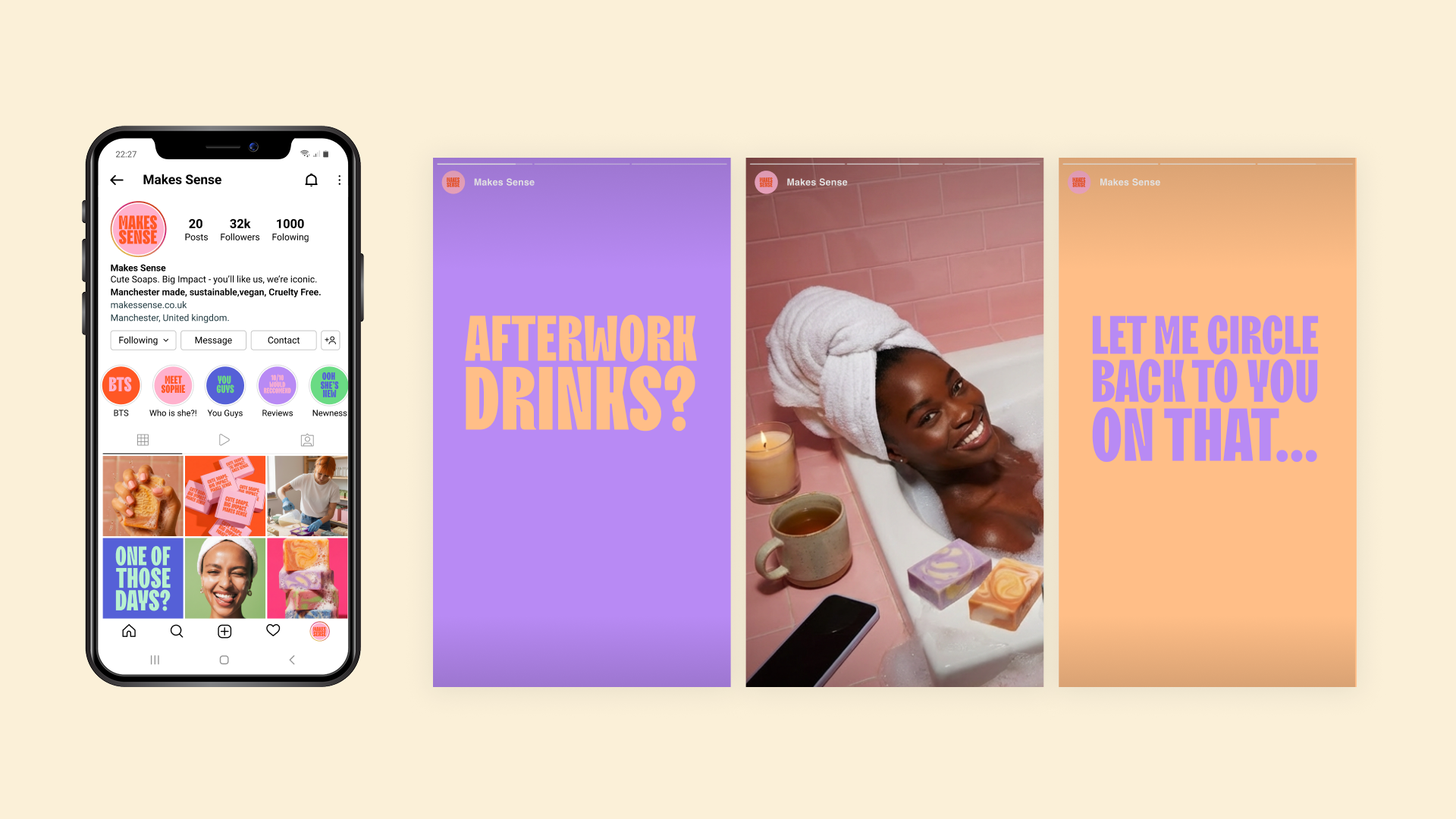
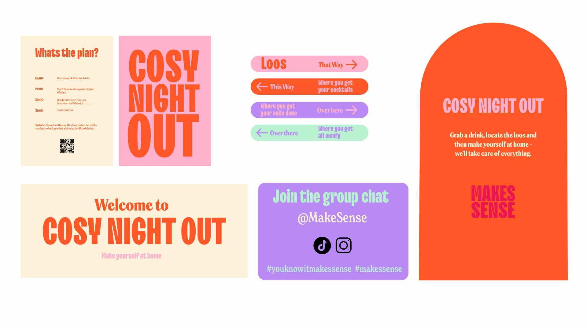
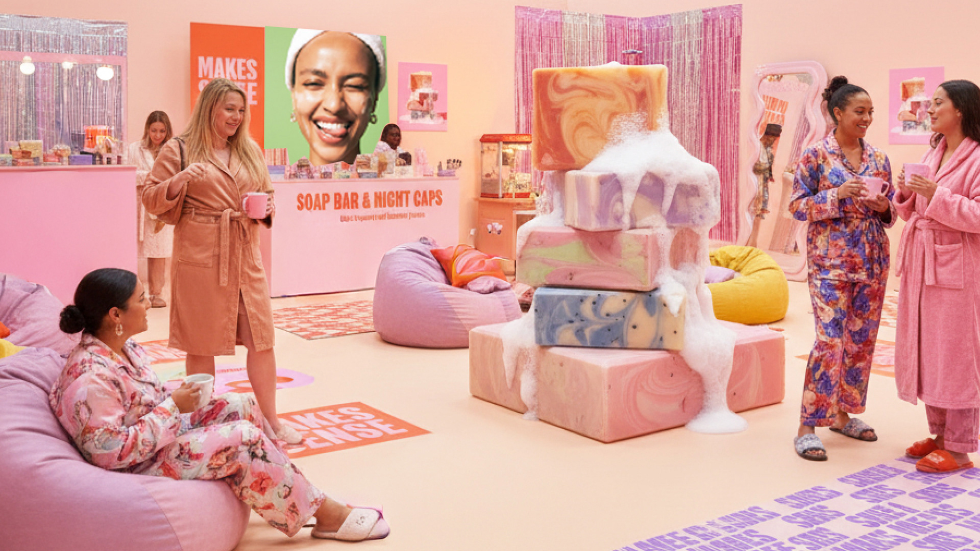
The final concept expands beyond packaging into a full brand world including social media, a website, billboard campaign and a pop-up experience. Tone of voice became the brand’s strongest tool — using playful, TikTok coded humour and confident messaging to connect with audiences and position sustainability as something joyful, modern and accessible.